Once a month our Creative, Insight and Client Services teams get together to share our latest favourite creative finds - this time it was everything UX. From discovering powerful ways to innovate navigations, to clever multimedia tools and forms, we looked around the web to find the lastest best in class user experience examples. Read on for our favourite four...
1. Estrid
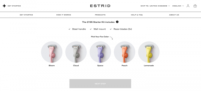
Estrid is a shaving subscription service that simply yet effectively communicates it's products and services on it's website. Harnessing many 2021 UX trends such as using plenty of white space, hiding the main navigation menu when not in use, and having a sticky navigation when scrolling up - the user flow is very precise and uncluttered, allowing visitors to the site to have a clear purchasing route to go down.
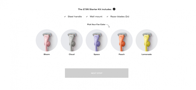
The home page navigation menu disappears as you delve deeper and scroll down into the content, leaving you with a very clear shot of their products and top line information. If the user wants to explore more however, as you scroll back up the navigation menu reappears and sticks to the top of the web page. The non-sticky / sticky navigation therefore seems to appear depending on the user needs.
Overall we also loved the clear step by step purchasing journey, from choosing your colour razor and how many times a month you shave, to completing your transaction. Throughout the whole journey there are only ever simple call-to-action buttons for the next step and a reduced navigation menu to just the Estrid logo if we wanted to go back. With Estrid's website simplicity is very much the key - and we feel it's mastered this in a clear and precise way that puts their products at the heart of user experience.
2. My Hermes
Following on from that, My Hermes offers a similar simple step by step process for sending a package through their parcel shop. Keeping the particular service front of mind, the rest of the navigation is tucked away as the user is moved down into the form section to make sure the user's focus is purely on the sales journey.
Once you enter the parcel sending process there are some key features aiding the user's experience throughout the journey that really caught our eye. They include a progress bar at the top for the user to understand how many more steps to go, a 'back' call to action incase they want to edit any details, as well as a summary box to the right so you can keep an eye on costs.
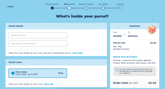
Another feature that stood out that we haven't seen quite as much, was within the form itself and the use of sign posting text in the form field boxes - not only is it clear which information needs to go where, but it means the form becomes stripped back with only a few lines, rather than multiple lines of text and boxes. With the lockdown meaning a higher use of online parcel services, this simplified form process allows the user to quickly and effectively send parcels within the My Hermes website for an on-the-go experience with an app-like feel.
3. The Year of Greta Thunberg
A huge name at the forefront of promoting the importance and severity of the climate crisis, Greta Thunberg is globally renowned for her speeches, insight and protests. So for those wanting to keep up with her latest work, a digital presence in key in keeping the movement growing and pushing forward. So when we stumbled across The Year of Greta website, highlighting a year of her work in 2019, we were pleasantly surprised at how they've displayed quite diverse content.
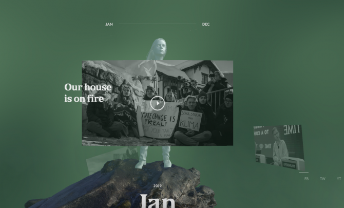
Devising a different on-page format to normal, it is a great way to raise awareness of what she's seeking to achieve and the challenges she's faced getting the climate change message out. It's an interactive and adaptive experience on mobile as well as desktop, with the use of sound making it an immersive experience too. Showcasing everything from video and audio from news coverage, through to social media excerpts and voice overs, it is a multimedia timeline experience.
Our Research & Insights lead, Lauren, thought this was a great example of a user interface that we haven't seen much of before - putting multimedia at the heart of the content. "Highlighting all the key political moments across 2019, the mix of the multimedia content snap shots of the year within a timeline format and using the scroll function to navigate through the months, make it a really engaging way to get users to interact with the page and take in more content than a simple written page."
4. VetBox
Another subscription service we discussed this month was VetBox - a monthly delivery filled with tailored products to keep your pet healthy and parasite-free. Following similar tactics to Estrid and My Hermes, the step by step process is easy to navigate and is uncluttered form other navigation and signposting.
What stood out to us on this website was the added personalisation across the purchasing journey. From the first step of asking the user's pet's name, the name is then used throughout the customer journey as demonstrated below with a not-so-commonly named pet, Greg.
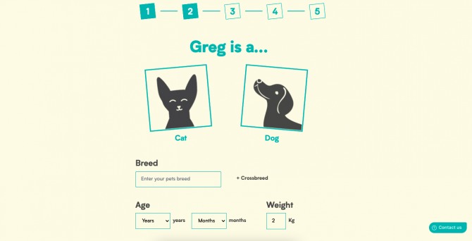
The use of the name throughout makes the process feel personal to you and intuitive, and even when it comes to inputting in your own details you are referred to as the 'Pet Parent', making something quite mundane, such as flea treatment, become a fun and quirky experience to purchase. The end user is clear to see, with the persona of a pet owner clearly thought about at every stage.
If you've come across any other UX moments that have caught your eye, or you want to incorporate some of these uses into your own website, comment below or get in touch with us at [email protected]. Stay tuned for our next month's addition of What's Happening..!